This is a topographical map of Australia. It shows elevation on the continent and major bodies of water. This map is mostly used for educational purposes and can be viewed as a tool to teach about where major contours on the continent are.
Thursday, April 17, 2014
Crab Island
This is an aerial photo taken in Destin, Florida of the local hot spot known as Crab Island. As you can see from the photo the amount of boats and people at this location. This photo can be used to produce statistical data of how many boats there where at crab island.
Paris, France
This is a map of Paris, France. This map type is a planimetric map showing features on Paris including buildings, bridges, and roads. This map could be used by anyone trying to navigate the city.
Crestview, Florida
This a standard map of Crestview, Florida showing interstate 10 and also bodies of water. It also shows roads. This type of map could be used to navigate the major roads and bodies of water.
Asia
http://www.ilike2learn.com/ilike2learn/asia3.html
This is a topographical map of Asia showing elevations and major mountain ranges. This map is used on globes and in classrooms to educate major things about the Asian continent.
Chicago aerial photo
This image is one of downtown Chicago. It can be classified as many different kinds of maps. It could be a cadastral map that shows different properties. It is also an areal photo taken from a high vantage point. It is also a planimetric map showing 3D imaging of the ground. This image is used mostly for entertainment and pleasure.
Tea thrives the world map
This is a propaganda map used by the British to show the value of tea as an export. It promotes the cultivation of tea stating that "tea revives the world."
Histogram of immigration
This is a histogram of the immigration into Northern Europe from 1900-1970. This may also be seen as a statistical map as it shows a statistic. This map could be used by an immigration bureau to conduct comparisons.
Circle map of Florida
This is a proportional circle map of the maximum level of rainfall in 24 hours in Florida. This map shows the areas in the state where it has rained the most in a 24 hour period. Circle maps are useful in decreeing quantities and relating them to certain areas on a map.
Population density in New England
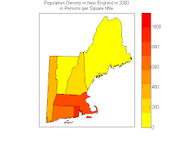
This is an example of a thematic map. This map shows the population density in New England in the year 2000. This may also be viewed as a statistical map because it shows a statistic. This map could be used by anyone conducting research on population growth or density.
Agricultural land
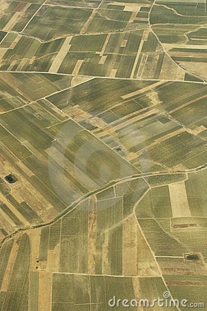
This photo depicts agricultural planes from an areal view. This image could be viewed as an areal map but also may be viewed as a cadastral map. This map shows the different properties in the land parcel.
Musical notes mental map
http://fastpianolessons.com/blog/reading-music-learning-note-names/
This is an image of the notes in musical scales. The acronyms in this image are there to help you remember the order in which the notes go. This image could be considered a mental map because it helps you to remember the notes of the musical scale.
This is an image of the notes in musical scales. The acronyms in this image are there to help you remember the order in which the notes go. This image could be considered a mental map because it helps you to remember the notes of the musical scale.
Water table in Florida
This is a map of the state of Florida that shows water table elevation in the state. This map could be considered a topographical map because it shows elevation. It could also be considered a statistical map because it shows statistical data. This could be used by scientists to examine water table levels in the state.
Nazi propaganda map
This is a poster that was distributed during world war two and when the Nazi regime was in power. This is a propaganda map that shows the Nazi's goals for the war. This map was meant to inspire those to join the Nazi party.
Ohm chart
http://www.grimmgreen.com/post/30254919697/vaping-power-chart-found-via
This map is a correlation matrix of ohms used in vaping cigarettes. You use this chart to find the right amount of power you should use in your battery for your electronic cigarette. I posted this map because i saw in in my store where I work.
This map is a correlation matrix of ohms used in vaping cigarettes. You use this chart to find the right amount of power you should use in your battery for your electronic cigarette. I posted this map because i saw in in my store where I work.
Old Faithful eruptions
This is a scatter plot of the Old Faithful eruptions. Each dot represents an eruption of the volcano and the duration of time it lasted. This type of map could be used for statistical analysis of the eruptions through time.
Mule deer in Montana
This is a statistical map of the state of Montana's mule deer population. It shows the general population range of the species in certain counties in the state. This information could be used by the fish and wildlife in that state to determine the distribution of the states hunting permits.
Aids cases in America
http://stevenmcmahonmapcatalog.blogspot.com/2013/09/dot-distribution-map.html
This is a dot distribution map of all the aids cases in the United States as of Sept. 1997. This map could be used for research into aids cases in America and compare them past years.
This is a dot distribution map of all the aids cases in the United States as of Sept. 1997. This map could be used for research into aids cases in America and compare them past years.
Austin, Texas freeway system
This is an areal photo of the Austin, Texas freeway system taken in 1984. This may also be considered a planimetric map because it shows roads, houses, and land parcels. This photo could be used to by local government to discern what impact the freeway system had on the city and maybe who would most likely use it.
Hurricane Francis
This is a doblar radar map of the recent hurricane Francis. This image was used by meteorologist to track and rate the severity of the storm.
Wednesday, April 16, 2014
Campus, Panama City
This is a planimetric map of our campus in Panama City. It shows buildings and roads and eve the body of water and dock that extends into it. This map is used by students to navigate the campus and find classes.
Campus, Tallahassee
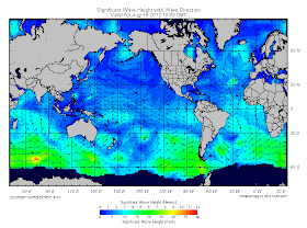
Wave height and direction
This is a statistical map showing wave height and direction in certain parts of the world. This map would be useful for examining wave direction for ships crossing the ocean.
Apalachicola river
This is a geographical map of the Apalachicola river system. It shows the mouth of the river all the way to the Jim Wuldroff dam. This map could be used by anyone trying to navigate the river.
Animation of hurricane
This is a cartographical animation of a hurricane moving across the Caribbean. These types of maps are useful in what-if scenarios. This is useful in predicting events.
Map of Vancouver
This is a planimetric map of Vancouver, British Columbia. This map shows roads and some buildings. It could be used by anyone trying to navigate the city or even by the cities government for zoning purposes.
Percipitation in California
This is a statistical map of the amount of precipitation in the state of California. This can also be considered a topographical map which shows elevation and mountain ranges. This could be used by the state to predict rainfall in certain areas of the state.
Shark attacks in Hawaii
This is a bar graph of shark attacks that took place in Hawaii between 1900-1997. This type of map may be useful to biologists and tourists looking to visit Hawaii.
Deer density
This is actually two statistical maps showing deer population in relation to environmental capacity. The red means population is above the environmental capacity to hold that population. Green means that population is below environmental capacity. Yellow means that population is equal to environmental capacity. This map shows environmentalists where to provide more hunting permits to hunters. It could also be useful to hunters when trying to find a place to hunt. This map compares deer populations from 1970 to 1980.
Precipitation in Boulder, Colorado
This is a climograph for the city of Boulder, Colorado. It shows the amount of precipitation and temperature so the two can be compared. This graph could be used by members of the city, meteorologists, and people who are just interested in the amount of rain falling on their city.
Infrared photo
This is an areal photo taken by a NASA satellite. It is taken using infrared imaging. it shows the cold weather (represented by blue) moving into the south of the country. This image can be used by meteorologists to predict the weather.
Tuesday, April 15, 2014
Average time it takes to get to work
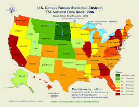
This is a statistical map of the United States showing the average time it takes to for citizens to get to work in each state. This was taken by the Census Bureau in 2003. There are many uses for this map and it provides a lot of information for people looking to move out of state, it provides information for the Census Bureau, and to owners of businesses.
Isobar of pressure
This is an isobar map of air pressure over the United States. The lines connect points with equal air pressure. This map can be used by meteorologists for examining weather patters.
Thematic map of New England
This is a thematic map of the north eastern part of the United States. The theme in the this map is median age in the represented states. This could be useful to people in marketing, business, or even during the presidential election.
Planimetric map of Iraq
This is a Planimetric map of Iraq. It shows roads, major cities, and boundaries of the state. It could be used by anyone trying to navigate through Iraq. It is also used by the military.
Topographical map of Idaho
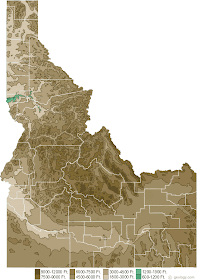
This is a topographical map of the state of Idaho. It shows elevations in the ground and also shows county boundaries in the state. It could be used by hikers, geographers, and people in agriculture.
Cartogram of the world
This is a cartogram of the world and its human population. Each continent is shown in this map and the more area covers by that continent, the more people it holds.
Propaganda map of the world
This is a propaganda map go the world according to Ronald Reagan when he was president. It distorts the actual boundaries of the world and renames them to express and idea of someone.
Lidar map
https://www.leidos.com/geospatial/modeling/lidar-urban-modeling
This is a LIDAR map of and urban area in the United States. This form of mapping can detect roars, buildings, power lines, and even individual trees.
This is a LIDAR map of and urban area in the United States. This form of mapping can detect roars, buildings, power lines, and even individual trees.
Central America's Percipitation
This is an isoline map of the mean annual precipitation in Central America in June 2008. It does contain three dot distribution maps for three major cities in Central America as well.
Monday, April 14, 2014
Niceville, FL
This is a map of my hometown, Niceville, Florida. it shows roads, and bodies of water. The red squares represent discharges of water, the green squares represent hazardous waste, the black squares represent multiple incidents of fluid leaks. Including hazardous leaks and river overflows.
http://www.city-data.com/city/Niceville-Florida.html
http://www.city-data.com/city/Niceville-Florida.html
I-10 interstate system
This is a map of I-10 or interstate ten. It is the largest road in the United States and travels throughout the southern part on the country. It shows the major cities that it passes throughout including other states in the U.S.
Kleberg county deer density map
This is a statistical map of the deer density in Kleberg county located in Texas. This shows how many acres per deer in the county. As you can see the deer density was slowly increasing between 1994 to 2000. http://www.tpwd.state.tx.us/landwater/land/habitats/southtx_plain/regulatory/pop_trends/kleberg_pop.phtml
State of Alabama
This is a standard topographical map of the state of Alabama. It shows elevations and the outline of the state as well as lakes and rivers.
Wednesday, March 26, 2014
Floridas citrus production
This is a dot density map of Florida's citrus production in the year 2001. The dots are measure in per square mile. Four dots in one square mile equals 450,000 ounces of citrus juice produced.
Wednesday, February 19, 2014
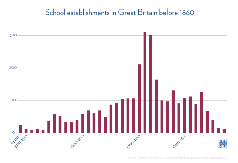
Schools in Great Britian
http://static.persquaremile.com/wp-content/uploads/2011/11/school-establishments-in-great-britain-before-1860.png
This is a Statistical map of school establishments in Great Britain between 1500 and 1810. Its represents how many schools per square mile the country had.
Population Density of the U.S.
 http://www.mapofusa.net/us-population-map.gif
This is a maps showing population densities for the United States. This map is a Thematic map.
Point Washington
 http://sowal.com/sites/default/files/point-washington-state-forest-map.gif
This is a map of Point Washington State forest located in Florida. This map shows bodies of water, roads, and man made structures such as restrooms and parking lots. This is a planimetric map as well as a cadastral map.
Florida State Talahassee
http://www.cge.fsu.edu/theglobe/directions.cfm
This is a map of the Tallahassee campus of Florida State. This map displays man made features and does not contain elevation. This is a planimetric map.

This is a map of the Tallahassee campus of Florida State. This map displays man made features and does not contain elevation. This is a planimetric map.
Wednesday, February 12, 2014
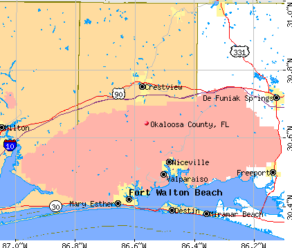
Okaloosa County
This map represents Okaloosa county. I reside here so I thought this would be appropriate to put in my map project. It displays major roads and cities in the county. This map can be classified as a cartogrphical animations map.


